Written By: David Ngo, PharmD, BCPS, MBA; Ben Moore, PharmD, MHCI; Killian Rodgers, PharmD, MS
Edited By: Alexis Berndt, PharmD, BCPS; Ryan Cello, PharmD, FASHP
In part 1, we discussed clearly defining the problem you are trying to solve and thinking about the story you want to tell when developing KPIs and metrics. Similarly, building dashboards should always begin with the goal in mind. How do we design and create our dashboards to answer questions, not just show off data?
Creating dashboards and reports that tell a clear, compelling story can be challenging. With so many visualization options available, each with distinct advantages and trade-offs, selecting the right approach takes thoughtful planning. Start by considering what your audience needs to accomplish. If users must quickly compare performance or spot trends, visuals that emphasize change over time such as sparklines, comparison metrics, or indicators versus a goal can be a great idea. These can make insights easier to interpret at a glance. If, on the other hand, users care about validating results or exploring the “why” behind the numbers, it’s important to provide access to supporting detail through drill-through functionality or a dedicated detail page.
Next, define the purpose of the report. If the primary objective is a high-level snapshot, a scorecard-style layout can be an effective way to summarize key metrics in a clean, digestible format. If the goal is to create an interactive experience where users can identify specific items within a workflow and take action, a more guided design such as a diagram, process view, or infographic-style layout may be better.
Finally, consider whether your dashboard includes a clear call to action, something users should do after reviewing the information. If the answer is yes, the design should make that action as easy as possible. This could include direct links to related systems, embedded workflow shortcuts, or interactive components that allow users to input, edit, or validate information without leaving the dashboard. In some cases, enabling comments or data updates directly within the report can help resolve discrepancies faster and add context where it matters. Ultimately, the most effective dashboards are designed with three essentials in mind: audience, purpose, and action. When these elements guide your layout and visualization choices, your dashboard becomes more than a set of charts; it becomes a tool that drives understanding and improved outcomes.
One example that creates a clear, compelling story designed with the audience, purpose, and action in mind is an interactive dashboard created for an inventory team to monitor cycle counting. This dashboard was built for pharmacy technicians to easily see which inventory locations and medications require cycle counting based on institutional policy. Its primary purpose is to streamline the cycle counting process, reducing the time staff spend searching for what needs attention.
To support day-to-day operations, the dashboard is displayed on a TV monitor in the medication warehouse and includes an intuitive warehouse map. Technicians can select a location directly on the map to filter the view instantly, narrowing the list to the specific medications due for cycle counting in that area. The call to action is clear and immediate: the dashboard highlights exactly which locations require cycle counts and which items are coming due.
To further support the process, the report includes alerts that notify staff when medications are approaching or past their cycle count due date. These alerts help keep the entire team informed, support timely follow-up, and shared accountability. As a result, this interactive dashboard has significantly improved cycle count compliance for medications stored in the central warehouse.
Example 1: An interactive medication cycle counting dashboard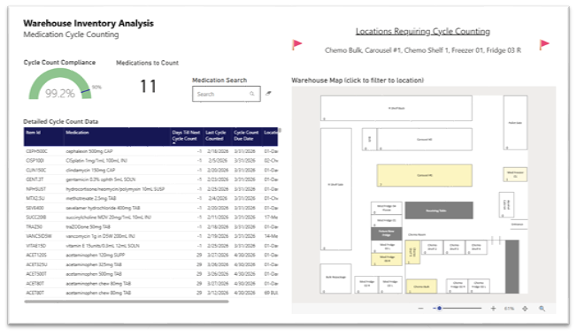
After the dashboard framework is in place, the focus shifts to implementation. While each organization has its own standards and governance for publishing dashboards, there are several best practices that consistently support successful adoption.
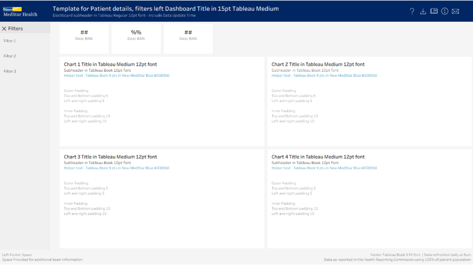
Having a standardized template that enforces consistent fonts, color palettes, and spacing across all organizational dashboards is helpful to ensure scalability and professional polish. Additionally, this helps to reduce the learning curve for users when they switch between dashboards.
Example 2: A dashboard template with organizational standards shared with analytics team members as they complete orientation and onboarding
Format the dashboard following an “inverted pyramid” flow: high level KPIs at the top left for immediate impact, followed by trend-based visualizations that provide context, and ending with granular tables for deep-dive analysis. This design mirrors how our eyes naturally scan, making sure the most important information gets noticed first. The goal is to give the user quick access to key insights, while still providing the data for a more thorough examination when needed. By incorporating accessibility features like color-blind friendly color schemes and responsive layouts, this ensures that a user checking the dashboard on a phone experiences the same clarity as someone working on a dual-monitor setup.
Utilize a hybrid push and pull strategy to ensure the dashboards act less like a passive report and more as a proactive diagnostic tool for the organization. A push strategy is like a smoke detector for your data. This ensures that vital information finds you, rather than requiring you to go hunting for it. An example of a push strategy would be weekly email snapshots to keep data top of mind without requiring extra clicks. In addition, setting up exception-based alerts that trigger notifications when a metric breaches a specific threshold. Conversely, a pull strategy is your diagnostic toolkit. It is the deep-dive dashboard you access intentionally to investigate underlying reasons behind those alerts. By combining the two strategies, you move away from passive reporting and toward a hybrid model where the data actively flags risks while providing the self-service tools necessary to solve them.
Dashboards are not static deliverables; they are “living” resources that evolve over time and require thoughtful maintenance to thrive. Building on the example from our first blog post, From Data to Direction: Building Analytics Pharmacy Leaders Can Trust – Part 1: Developing Metrics and KPIs, let’s take a closer look at the ongoing work that helps keep the IV Fluid Shortage dashboard an impactful decision‑support tool.
The core question we faced when hurricane Helene caused a massive IV fluid shortage was “what is our utilization of these products and where can we reduce it?” Recognizing that we didn’t have perfect data on inventory, we used charges as the best surrogate that was well documented even in procedural areas. The dashboard needed to answer overall questions about conservation efforts but also help identify specific hospitals and units that were doing well and those that needed additional intervention.
Example 3 – IV Fluid Shortage – UNC Health
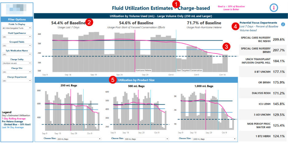 1 - Used the data source that was most available – charges. Dispenses, purchases, and inventory may have been more ideal but were inconsistent across sites.
2/3 - Clear metrics and visualizations that are easy to interpret gave executive leaders not only a pulse check, but a clear goal to rally their teams behind.
4/5 - Different visualizations for different target audiences. Allows the same dataset to benefit different groups – nursing can focus on utilization in their specific departments while pharmacy can target specific bag sizes and monitor inventory.
Governance is a key consideration with any analytical asset, especially ones with broad reach like enterprise dashboards. Partnering with your data governance team early, if one exists, can help ensure best practices are followed and documentation is completed early.
In this case, we knew that speed was paramount over accuracy and governance, so while we worked closely with the data governance office to follow best practices, we intentionally released the dashboard before going through the lengthy certification process. This was necessary in this case, but generally best practice is to perform robust validation and work through the governance process prior to releasing an analytical product.
Maintenance is also a key consideration. In the rapidly changing landscape of healthcare, definitions and metrics change frequently and systems must be in place to ensure analytical products are up to date.
At UNC Health we use an annual review and deprecation policy that requires the business owner of each analytical product to confirm that they are still utilizing the product and indicate if any updates are needed. For this dashboard, it was retired 2 months after the shortage was over since it was no longer needed. However, the underlying queries and dashboard build were archived so that in the event of a similar shortage in the future we are able to quickly bring it back online.
Effective dashboards are not defined by how much data they display, but by how well they support confident decision‑making. When built with clear intent, implemented thoughtfully, and maintained with strong governance, dashboards evolve from static reports into trusted tools. Ultimately, the most impactful dashboards are those that continue to adapt and guide teams when it matters most.